Babu was a startup of 2 New York located mothers. Their dream was creating a marketplace app where women in different phases of pregnancy or early maternity could find a service giver they need.
The main service of this marketplace is the doula. A doula is a trained companion who supports the mother to be, providing her continuous care before, during, or after the child birth, in the form of information, advocacy, physical support, and emotional support.
Therefore, it is crucial for the mother to find the right doula for her.
This is a challenge the app should solve.
The project
Context
When the clients contact us they had an "idea on a napkin". They were both young mothers that had a personal experience with trying to find the right doula for them. They explained that a doula is not like any other service, a doula is like a mother, a norse and a friend combined together, so an emotional connection is crucial.
Goal
Designing a mobile app for iOS and Android. The app is a marketplace for prenatal and postpartum women and relevant service givers.
The user of the app are young mothers and mothers to be.
The service providers' interface is out of scope.
My role
-
Project manager
-
UX designer
Business objectives
First step
Since the clients didn't have a basic business plan and definition of their product and users, I built a 3 meetings plan to define their business objectives. In our meetings, I presented questions about the basic business infrastructure and their vision for the early stages of the product, and what it will grow to be.
Vision: building a community of parents and support network
Values: supportive, inclusive and non-judgmental
Our users are in a very sensitive and stressful state of mind and need a supportive environment. Choosing any service provider is crucial, and in particular a doula, that should give the user emotional and physical support, guidance, and information.
Since the doula is an ongoing service she can also be the hub that connects the user to other service providers.
Vision & Values
Registration is free for users and providers
Payment is done through the app
Babu keeps a percentage of the transactions - lower than other coordinators in the market
Service providers are freelance and not Babu employees
We chose a well-known business model. However, this model presents a challenge when it comes to our unique product. Since most of our services are very personal we believe the user should have a conversation with the provider before choosing it.
The risk is that the user and the provider will negotiate a transaction outside the app.
Business model
Users and providers idle balance
Ongoing interaction (doula, personal trainer): 1:30 | One-time interaction (masseur, chef): 1:50
The number of transactions and the total value
The pricing rates are yet to be determined. The goal we could agree on is returning their invest within 6 months
The users and providers KPI's determined after research of other services e-commerce sites and apps, like Airbnb and Uber.
The clients couldn't decide on a specific number, so they set a goal related to their still not final investment.
Success & KPI
the main users are expecting mothers. These users are most likely to use Babu's services
Since Babu’s community values are the unique selling point, the relevant user is an advanced consumer looking for “just the right doula" (or another service provider)
The user definition is based on research done by the clients, together with some of their assumptions.
Further research was required to validate those assumptions and to learn more about our users.
User definition
User research
Second step
The users we interviewed were the main target audience as we defined it:
-
Expecting mothers
-
Living in New York (planed to be the first launch location)
-
Uses e-commerce apps or sites
-
Considering hiring a doula
I wrote the research questions and the interviews were conducted by a NY located research agency. 9 women were interviewed.
Interview questions
These are the main questions - The drill-down questions were removed..
Motivation
-
Do you have any previous knowledge about the
doula service? -
How did you first hear about doula service?
-
What made you decide to hire a doula?
Doula personal features
-
What are you looking for in your doula? describe
the perfect doula. -
What is the most important thing in a doula?
-
What is the second most important thing in a doula?
Pains
-
What is your biggest concern when it comes to
the doula service? -
How will you feel if a doula will give you advice that conflicts with your beliefs?
-
How can you prevent your concerns to happen?
Babu app
-
Do you believe you could find and hire a doula from a mobile app?
-
What will help you to choose a doula through a
mobile app? -
How much is it likely that you use this app?
E-commerce sites/apps research
For this research, I used other relevant researches I conducted for previous projects.
I applied these principles in this project as you can see in the Wireframe and Design step.
Main challenge:
Build trust and engagement with the doula
During the interviews, it became clear that the main concern or the user is trust.
The expecting women and the young mothers are in a very sensitive phase in their life. They don't know what to do and what does the future hold.
They know they need some support but they don't know who can they trust to give them what they need.
"My mother and sister live in Missouri so I don't have anyone to guide me that I feel safe comfortable with and I feel alone."
Marie
"I want to have a natural birth and I need someone to buck me up with the doctors because I'm afraid they won't listen to me"
Sasha
"I shop online a lot, but how can I choose a doula online? I need to see her face to face to feel if
I can trust her, have chemistry... it's a very personal issue.
Lesley
Persona
I created the persona based on the research, and I thought about her in every step of this project.

Screen map & Features
Third step
Based on the research and the business objectives desitions, I create the tools that will help me manage and design the project
Feature list
includes all the product features prioritize by the app MVP and the developing requirements. The next step was adding the schedule for each feature - the due date for UX design, Graphic design, and development.
I gave priority to features that build trust between the user and the doula, and to those which can engage the user.

Screen map
Illustrates the screens' hierarchy and flows and presents the relevant features on each screen. This will guide me during designing the app.

Flow chart
Presents all the actions and desitions the user does while using the app. This is the best way to understand the user's journey and to detect flaws in the flow.

Wireframes and design
Third step
Onboarding
To engage the user I wanted to give her a personalized experience. In order to achieve this goal, I chose to design an onboarding stage that includes a few questions that will help me know who she is and what she needs (her "pains").
To make sure that the onboarding will no be a pain in itself, I kept these principles:
-
The onboarding is not mandatory - the user can skip it whenever she wants.
-
The onboarding will be short.
-
Orientation - the user will know in which step she is and what she required to do.
-
Trust - the user will understand why the information she gives is required.
Hover to read the comments
Short and precise description of the app includes a main value - all the providers are "hand picked".

These are our 2 personas - each one of them has different needs and will be presented with other services.

As we explain to the user in this screen, we need her zip code to offer available services close to her.
Short and precise description of the app includes a main value - all the providers are "hand picked".
Navigation
The app has 3 content sections:
-
Services - this is the main screen that presents all the relevant services. This is where the user chooses the services she wants.
-
Callendar - after the user chooses a service, the meetings schedule appears in the calendar.
-
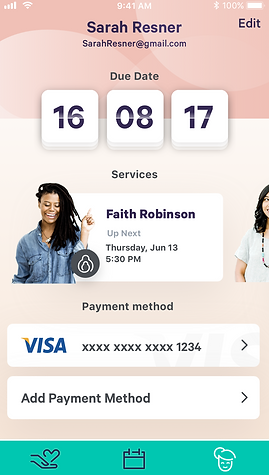
Personal profile - the user's profile, includes personal information, payment method, and payment history.

Services
After the user completes the onboarding she is presented with all the services relevant to her. The services she chose at the onboarding appears first.
To give the user a sense of control I gave her all the information she needs:
-
At the top of the screen, there is a caption that gives the promise that every service provider is handpicked.
-
Each service presents the number of available providers, and how many of them are near her (based on the zip code she provided. It also presents a description of the service.
The user chooses the service by tapping it.
A
After the user chooses a service, this screen appears, presents the available providers.
The challenge in this step is to help the user to understand which provider will suit her the most.
Again - the solution is information.
-
First, at the top of the screen I added a caption that addressed her biggest concern, in this case regarding the birth doula, (as I learned from the users' interviews) - that the doula will not be available on the day of the birth. I ensured that all the providers on the list are available on her due date.
-
In each provider card, the user can see a high-quality picture of the doula, short testimony, the doula experience, and how close she is to the user location.
The user taps the provider card she is interested in.
B


Sevices > Provider screen
This was the big challenge - how to build trust and engagement between the user and the provider.
I design the service provider page to let the user feel she knows the providers, and give her answers to any questions she might have.
Since our users used to shop online, I used e-commerce conventions, and adjust them to the unique product of Babu.
First, I wanted the user to know the doula (or any other provider), and feel her vibe so she could connect to her.
At the top of the screen, there is a high-definition professional picture of the doula and a caption presenting her, and the most important - a short video in which the doula talking about her service and her beliefs.
This is as close to a face-to-face meeting as I could achieve.
In the research, I found that many of the users didn't know the meaning of the service. In the case of the doula - what are the frequency and duration of the meetings, when should she start meeting her, etc.
I wanted to confront this pain as soon as possible so I presented all the services available by this doula.
By tapping each box a new screen will appear with a detailed explanation.
As my research showed, the best way to build trust is through user reviews.
Our users declared that reviews are the most crucial element in their decision to buy the product.
Again, some of the users are oblivious to this service, so I have to give them all the relevant information, using FAQs, which is also a convention in e-commerce sites and apps.
The user has 2 CTA:
-
Book now - opens a callandar that presents the doula's available dates.
-
Let's talk - opens a chatbox with an option to send a message for the doula. We chose not to reveal the doula's number to avoid interaction outside of the app.
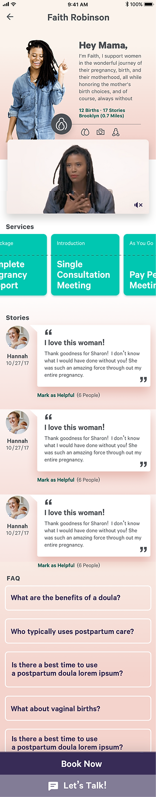

Only after the user understands the value she receives from tha app and chooses to book a service, we ask her to sign up to the app.
Only after I give something to the user I'm allowed to ask them to give something back.

Calendar
This screen will be the user's main screen while working with the doula. Here is where the user and the doula manage their schedule, which applies to the payment that is done through the app.

Profile
The profile contains the information the user gave on the onboarding, the payment details, payments history, and upcoming event.